West Palm Beach's supply-pressure line climbs to 100 and stays pinned there. Nashville's dips back into balanced in 2028 and eases off. Until this week you could see one number per market. Now you can put five markets on a single chart and watch the lines cross.
Most weeks here I write about plumbing: the ontology, the learning loop, the verification gates. This week was the other kind. Four things shipped that anyone can go open, and they are the clearest picture yet of what the database is actually for.
The Atlas became an instrument
The Atlas is our data surface, and it used to read like a report. Now it reads like a tool you operate. Eight views, each its own page: Overview, Markets, Projects, Firms, Supply, Pricing, Capital, Pipeline.
At the top sits the master chart. The markets are the series and the metric is the lens, so you add up to five markets as purple pills and swap what the chart is measuring underneath them, with a 6-month, 1-year, 2-year, or all-time range toggle. Search a market and it becomes a pill that filters the entire page, tiles, leaderboards, supply cards and chart together.
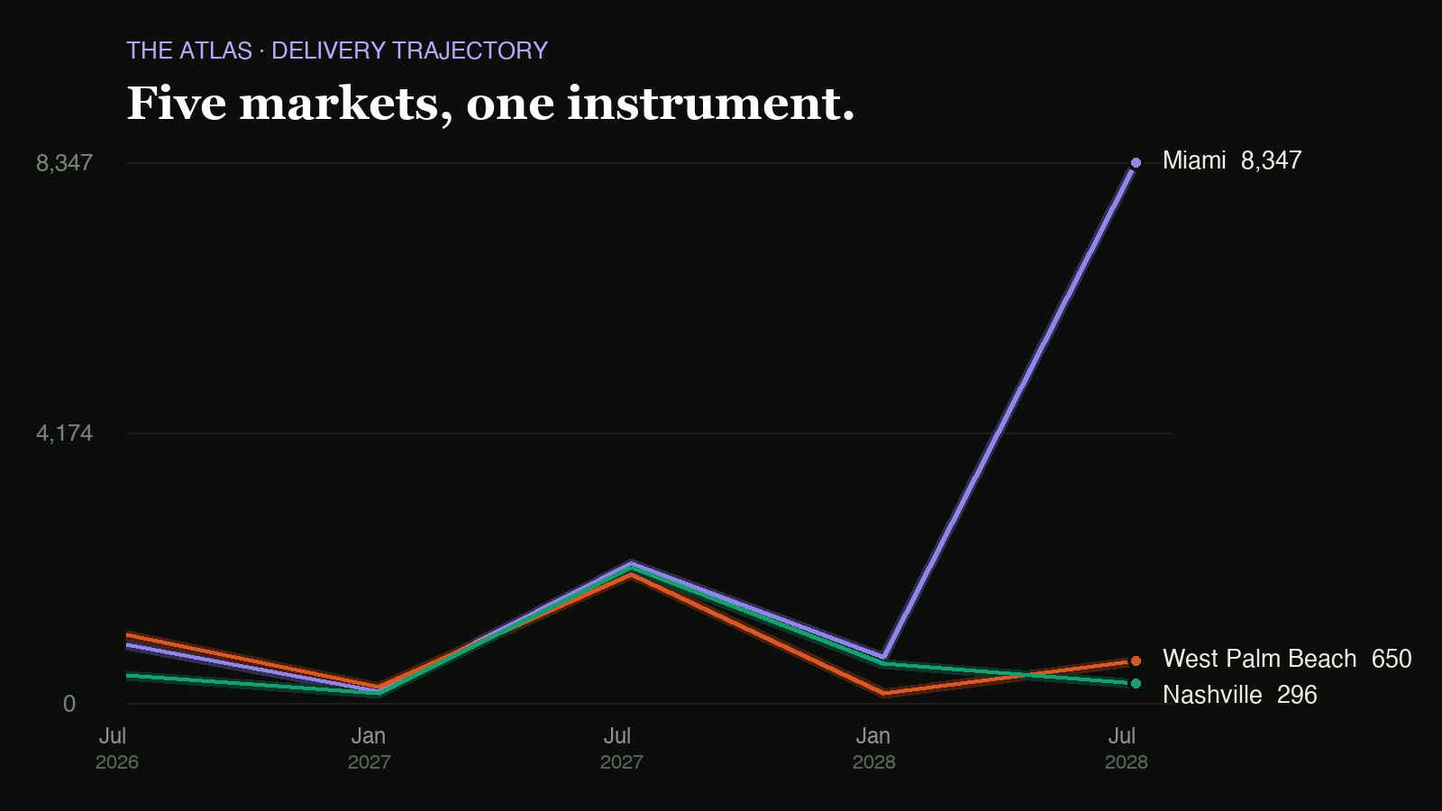
The best thing on it is supply pressure over time. A month ago we shipped it as a single score per market, how crowded a delivery calendar is getting. This week it became a trajectory: the same model run at every forward half-year across a five-year horizon, so you see saturation build as a wave of towers approaches and ease after it lands. Each line's color runs on a gradient keyed to its own height, green through yellow into deep red, so a market climbing into trouble looks like it. Zone bands behind it, a crosshair that names every market's zone at that point in time.
And every metric carries a truth label. Tap the (i) and it tells you plainly what the number is, whether it's a modeled judgment or a curated count or a sourced floor, what it excludes, how confident the model is, and the as-of date. I care about that more than the chart. A number without its provenance is a vibe.
Two smaller ones I like. The market picker now groups by region instead of dumping eighty cities in a wall, backed by a region table for 75 countries that lives in our ontology, so the map, the Atlas and our automated routines all agree on what continent something is on. And market pages now compare a market to its real geographic neighbors. London used to get compared to Coral Gables because their supply scores were close. Now London gets Paris and Lisbon, and when a market genuinely has no peers the module says "comparable markets" instead of pretending they're neighbors.
Your own instrument: saved views and My Book
Any slice of the Atlas can be saved as a view, and a saved view isn't a bookmark. It lands on your dashboard as a live module that recomputes its own count through the same matching logic the Atlas and the map use, so a tile can never disagree with the page it links to. And because an empty grid is the standard failure of a build-your-own dashboard, there are three one-click starting bundles: Developer, Broker, Investor, each seeded from the markets you already follow.
Under that is My Book, which is the thing I open most. Tap the bell on any project anywhere on the site, on the map, on the radar, inside an Onyx answer, in an article, and it goes into your book. The book is a table: every project you track with a progress bar against its delivery, the delivery date itself, and a movement column showing its last dated move. Above it, four live reads: how many projects you're tracking and how many moved this week, the supply pressure of your top market, the total construction capital tracked across your book, and your next delivery. Market chips filter the whole thing to one city.
Then every Monday you get a brief. Week of the 3rd, the moves on your watchlist, pulled from what actually happened on your projects, your followed markets and your followed firms in the last seven days, written up by Onyx.
That is the honest pitch for the whole platform: not "here is a database," but "here is your book, and here is what moved in it while you were busy."
The Opening Radar
Then we turned the pipeline into something you'd browse for fun. Hotels of Tomorrow got the Opening Radar, a live board of every tracked hotel in the forward pipeline, 304 with photography across 37 countries, sorted by what opens next. Filter rows for location, opening window (next 6 months, 2026, 2027, 2028 and beyond), brand, and stage, with the brand list derived from the live data rather than a list I maintain. Gold means opening soon, green means building, purple means announced. Every card has a bell.
Golf of Tomorrow got the same build a day later with a filter row of course designers and developers, so you can pull up everything Cabot or a specific architect has coming. Restaurants too.
The pipeline maintains itself underneath. A project flips from Opening Soon to Now Open on its stated opening date, and the flip has to cite something, our own coverage of that project if we have it, the developer's official site if we don't, so the marker always links to something you can verify. Freshly opened properties pin to the top of the radar for four months and then clear out on their own.
The Passport
The one I did not expect to enjoy this much. We publish iconic lists of hotels, golf courses and restaurants. Now you tap "I've been" on any of them and it saves to your account, one tap, no form. Those check-ins feed a single running level along with your travel, and there's a public leaderboard ranking everyone by hotels, courses, restaurants and total. Opt out any time, and no email is ever shown, only the name you chose.
For two years we've written about these places. Now the people who have actually walked into them write back, and that record of where our audience has been is a layer nobody else has.
What this compounds toward
All four of those are one idea wearing four faces. We spend most weeks on the unglamorous part: a verified database of 1,600+ developments, the ontology that encodes what our categories actually mean, and the verification gates that make sure nothing enters it that can't be proven. That work is invisible on purpose. This week is what it was for. A chart that can be trusted enough to argue with, a book that tells you what moved, a radar you can browse over coffee, a passport worth filling in.
The everyday layer is free, so go open the map, filter a market, and ask Onyx something in plain English. TMW Pro is where it opens all the way: Deep mode reasoning across a hundred-plus verified projects at once, the full dossier on every building, the whole radar instead of the first screen, and the supply and pricing read underneath a market. Worth ten minutes of poking around.
The model is still the rented part. The chart, the book, the radar and the graph underneath them are ours.