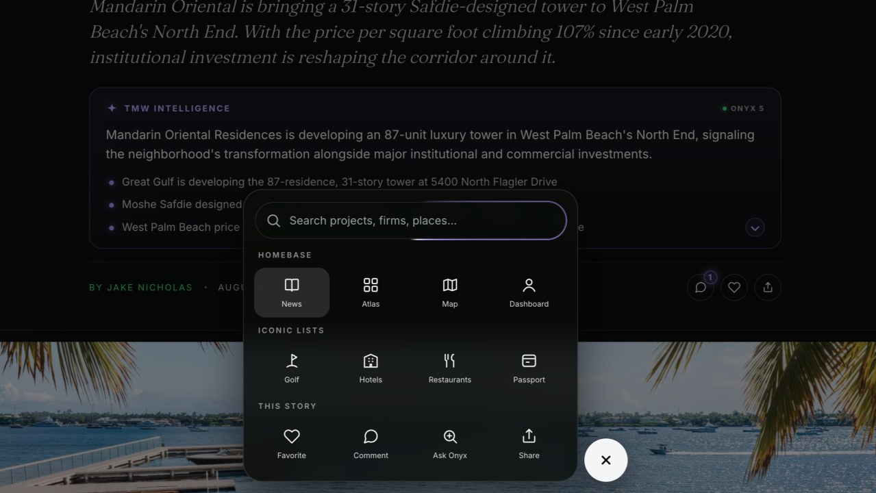
For two years the navigation was a bottom pill with a search box and three toggles. This week it became the dock: one unified layer that carries the whole platform.
Collapsed, it is a centered cluster: a glass pill of icons with a plus button beside it. Expand it and the two slide apart while a tray grows upward with the platform's core sections in fixed four-column grids, Homebase, News, Database, Atlas and Dashboard, then the Iconic Lists, golf, hotels, restaurants and the Passport, topped by an Onyx bar wearing the same purple glow as the floating search.
The part that earns the word dynamic is that the dock reads the page you are on and changes its tools to match. On a story it offers Favorite, Ask Onyx and Share. On a project page, Watch and Ask Onyx. On the map, spatial search, Compare and Share. And the collapsed pill always carries one glowing purple smart action, pointed at the thing you are most likely to want on that page.
Under the hood that took a surface contract: every surface answers the same four calls, search, open, watch, context. The old dock hunted for buttons with CSS selectors. The new one asks, and each surface answers in its own native way.
The Passport got a front door
The Passport shipped a few weeks ago: tap "I've been" on any hotel, golf course or restaurant on the iconic lists and it saves to your account instantly, no form, feeding a running level and a public board.
This week it got a place to live. The Passport moved to its own home at passport.oftmw.com, and every member now has a personal card page at /m/ plus their member number, with a QR code that points at it and proper share images so the card renders everywhere. It also took a permanent seat in the dock's Iconic Lists row.
A leaderboard nobody can show anyone is just a database row. A member number with a QR code and a share image is a thing people put in front of other people. I am at 92 places and taking that number personally.
The map and the Atlas got easier to read
The map now searches states and countries. Type "Colorado" or "Turks & Caicos" and the region surfaces with its project count, then filters the map to everything inside it. Until now only city names and project titles matched, which left whole markets unreachable from the main discovery surface.
The Atlas compare chart learned to treat a whole state as one market. Add Florida and it synthesizes a combined line, summing delivery windows and units and weighting the supply score by unit count. The desktop header was reorganized, metric top-left, year toggles top-right, market pills below, and the mobile chart now renders in its own viewBox because its labels used to draw at about a third of the intended size on phones.
And market pages stopped leading with one flagship project card. All 305 of them now open with the submarket median and its band under "Where this city prices out." One project is an anecdote. A median with a band is an answer. Onyx got the same treatment, full project cards instead of duplicated heroes.
The front door
The signup flow was rebuilt as a full-screen moment over rotating real project photography, and your member number arrives as a moment of its own. Every paywall on the site now runs through the same screens, so the pitch never shows up dressed differently twice. Pro is $32 a month or $300 a year, with a 14-day trial on both.
What this compounds toward
For two years the argument here has been that the moat is underneath: the verified graph and the rules that keep it honest. This week was the other half of that truth. Nobody experiences a graph. They experience a dock that knows what page they are on, a chart they can read on a phone, and a passport they can actually show someone. The interface is where all that invisible discipline finally becomes worth something.