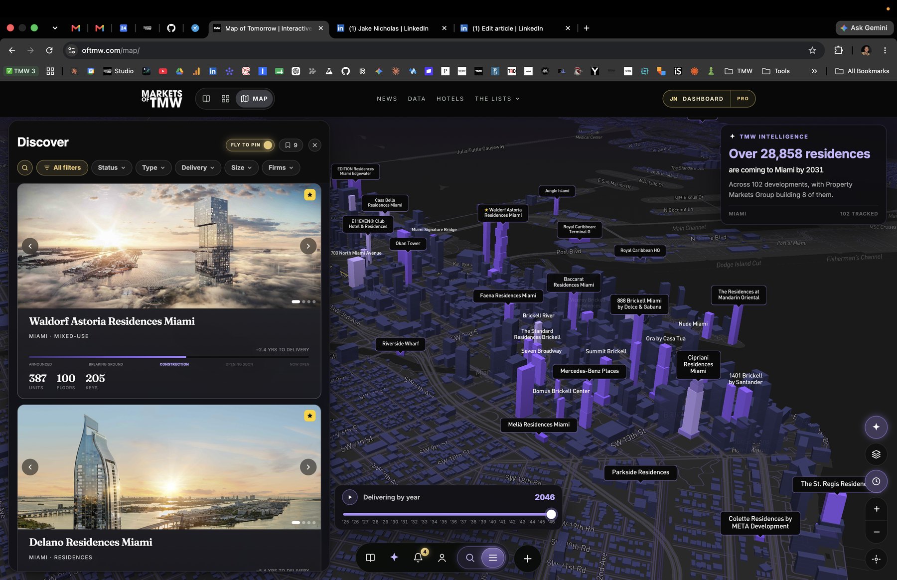
We spent this past week completely rebuilding the heart of Markets of Tomorrow: the interactive map where our readers explore more than 1,000 of the world's most ambitious developments. This is the biggest leap the platform has taken since launch.
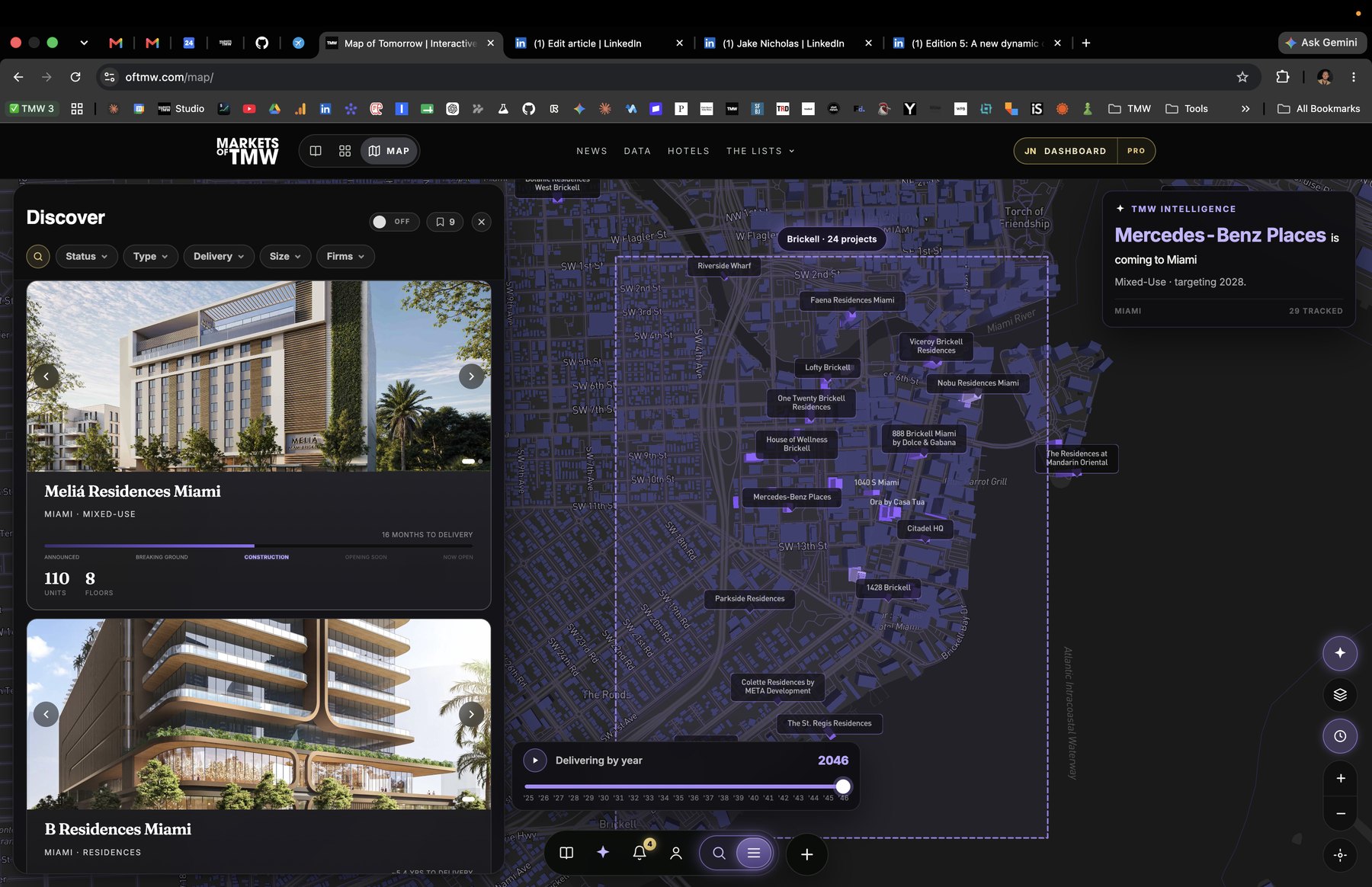
Full 3D mode
The map no longer shows you where the future is being built. It shows you the future itself.
Zoom into any major market and the skyline of tomorrow rises in front of you: every tracked development rendered as a 3D massing at its real height, standing inside the existing city, which renders around it in full 3D for context. Districts read as districts. Supertalls read as supertalls. You can tilt the camera and look down Brickell Avenue at buildings that will not top out for years.
Then drag the "Delivering by year" scrubber and watch the city assemble itself, year by year, through 2046. It is the closest thing we know of to time travel for real estate.
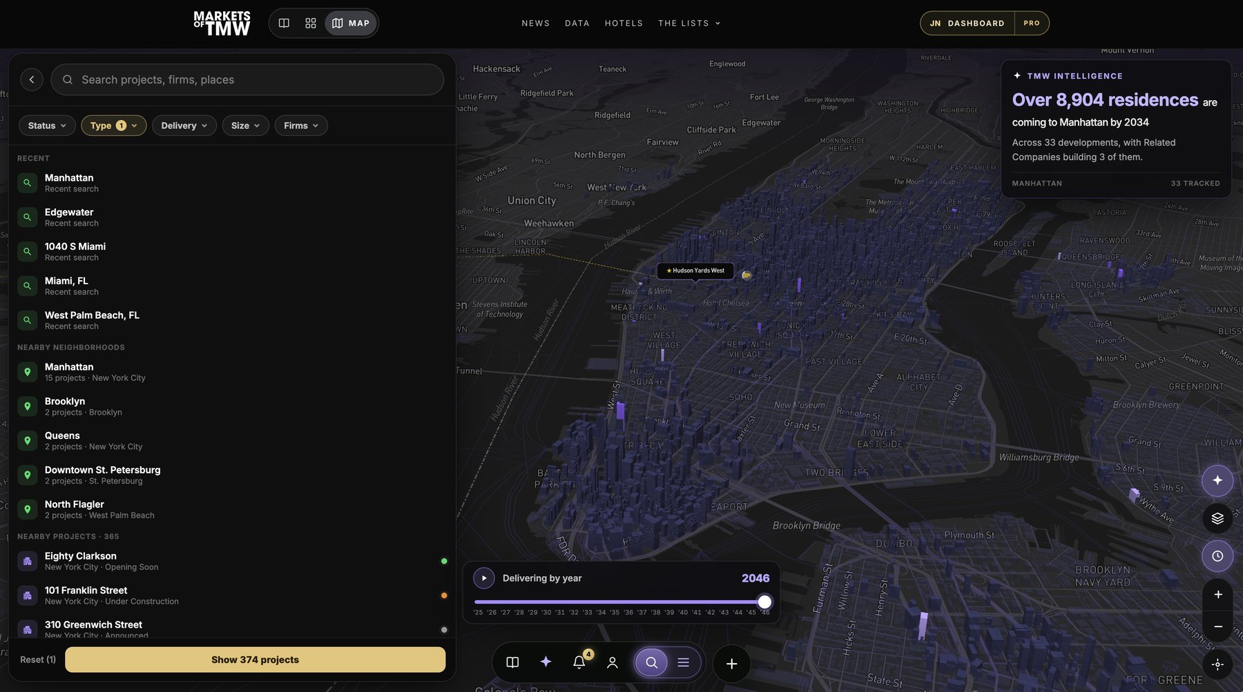
Search that answers questions
Search used to find things. Now it answers questions.
One search surface handles projects, firms, cities, and neighborhoods, with your recent searches and what's nearby surfaced before you type a letter. Beside it, a full filter set: construction status, asset type, delivery window, size by units or floors, and developer or architect with autocomplete across every firm in our database. Every filter shows a live count, so "under construction hotels delivering by 2028" resolves to an exact number of buildings before you even apply it, and the pins, towers, and results update as one.
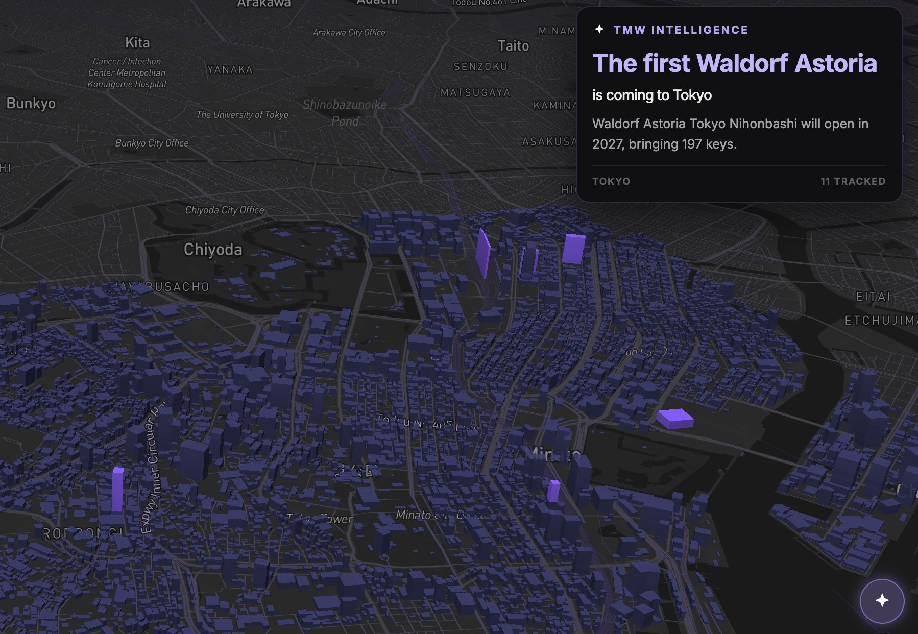
TMW Intelligence, live on the map
As you move around the map, TMW Intelligence reads what is actually in your frame and tells you one true thing about it: the new tallest tower coming to your viewport, how many developments are coming to that stretch, how many deliver in the next three years, the first arrival of a brand in that market.
The facts rotate as you explore, computed live from whatever your camera is looking at. It turns panning around a city into a briefing.
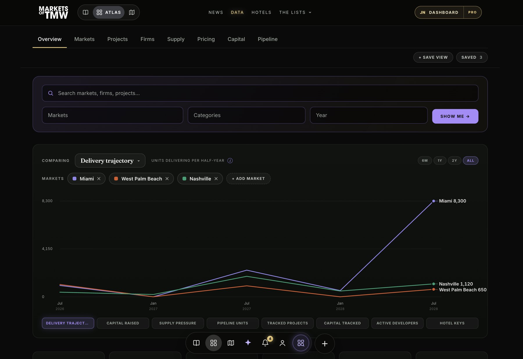
A redesign under all of it
Everything above sits inside a complete UI and UX overhaul. Browsing, search, and full project pages now live in one floating panel instead of scattered popups. Building name tags were redesigned, with featured projects carrying a gold star and priority placement. A universal action bar follows you across the entire site. And the map's data layer was rebuilt to load dramatically lighter than it did a month ago, so the whole experience is faster on every device, especially mobile.
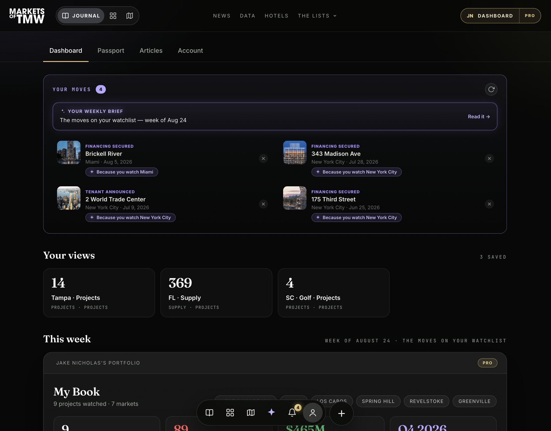
Your dashboard
Alongside the map, every member now has an upgraded personal dashboard: your watchlist of followed projects with live updates, your saved properties, and your weekly brief on the markets you care about, in one place. It is the command center for people who treat the future as an asset class.